
April 2024
Branding
49 min read
A good makeover never hurt anyone
Every person has a brand—or brands—that have caught their attention and that they have followed since the very beginning. In the rapidly changing advertising environment, times change, and so do brands. So, after shifts in consumer habits, the sign of the times, or years of the same-old same-old, it’s natural for a brand to be ready for a bit of a glow-up.
We’ve witnessed the brands who have attempted rebrands or new looks that have flopped. But what about the brands who got it right? While some brands underwent major design reconstructions of their logo and color palette, others returned to their roots with a more minimalist approach.
You’ll find that the most successful rebrands, while they fine-tune their image, still stay consistent with their values and who they are as a brand. Let’s explore five famous rebrands from throughout the last century:
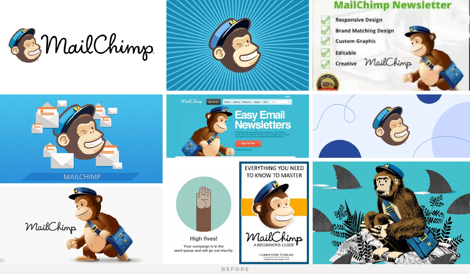
Mailchimp
The Mailchimp rebrand in 2018 was a strategic initiative undertaken to not only reflect the platform’s growth beyond email marketing but also to inject a fresh sense of vibrancy and approachability into its brand identity. With Mailchimp expanding its services to encompass a broader spectrum of marketing solutions, the rebrand was essential to signal this evolution to both existing and potential users. By adopting a more versatile visual identity and messaging, Mailchimp aimed to convey its commitment to empowering small businesses and entrepreneurs with comprehensive, user-friendly tools for their marketing needs. Moreover, the rebrand was strategically timed to coincide with Mailchimp’s ambition to solidify its position as a leading player in the competitive digital marketing landscape, emphasizing its adaptability and agility in catering to the diverse requirements of modern businesses.
One of the standout features of the Mailchimp rebrand in 2018 was the introduction of a playful illustration system, which added a unique and memorable visual element to the brand’s identity. This illustration style, characterized by its whimsical characters and vibrant color palette, served not only to differentiate Mailchimp from its competitors but also to evoke a sense of creativity and personality. By incorporating these playful illustrations across its marketing materials, website, and product interfaces, Mailchimp effectively humanized its brand and made complex marketing concepts more accessible and engaging for its audience. This playful illustration system became synonymous with the Mailchimp brand, contributing to the overall success of the rebrand by reinforcing its values of creativity, innovation, and user-centric design.

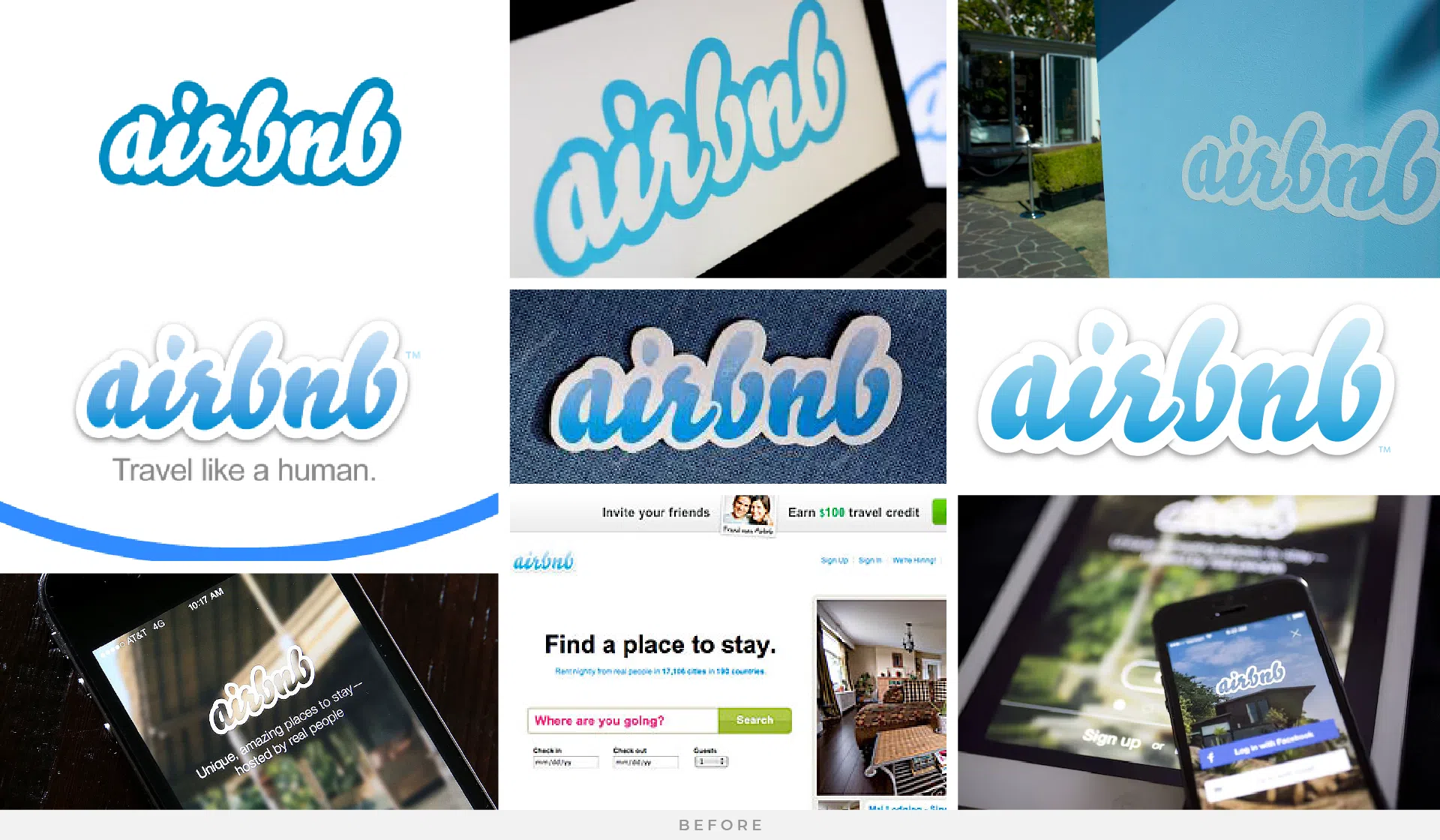
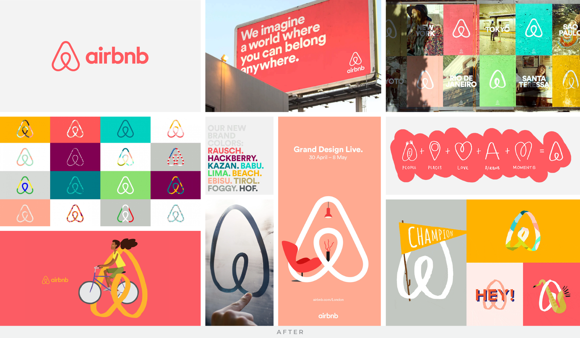
Airbnb
The Airbnb rebrand in 2014 marked a significant milestone for the company as it sought to transcend its roots as a mere lodging platform and evolve into a global community-driven hospitality brand. The need for this rebrand arose from Airbnb’s desire to communicate its broader vision of fostering meaningful connections and unique travel experiences around the world. By refreshing its logo and visual identity, Airbnb aimed to reflect its commitment to diversity, inclusivity, and the spirit of adventure. Additionally, the rebrand was driven by the company’s expansion beyond traditional accommodations into new areas such as experiences and adventures, necessitating a brand identity that could encompass these diverse offerings while maintaining coherence and resonance with its global user base.
The success of Airbnb’s rebrand in 2014 can be attributed to its ability to capture the essence of the company’s ethos and aspirations while resonating with both existing users and potential customers. The new logo, characterized by the iconic “Bélo” symbol, symbolized belonging and unity, encapsulating Airbnb’s mission to create a world where anyone can belong anywhere. This rebranding effort was complemented by strategic marketing initiatives and community engagement programs, which helped foster a sense of trust and connection among users. By aligning its brand identity with its core values and leveraging storytelling to evoke emotion and inspiration, Airbnb successfully positioned itself as more than just a lodging platform but as a catalyst for meaningful experiences and connections around the globe.
Dunkin
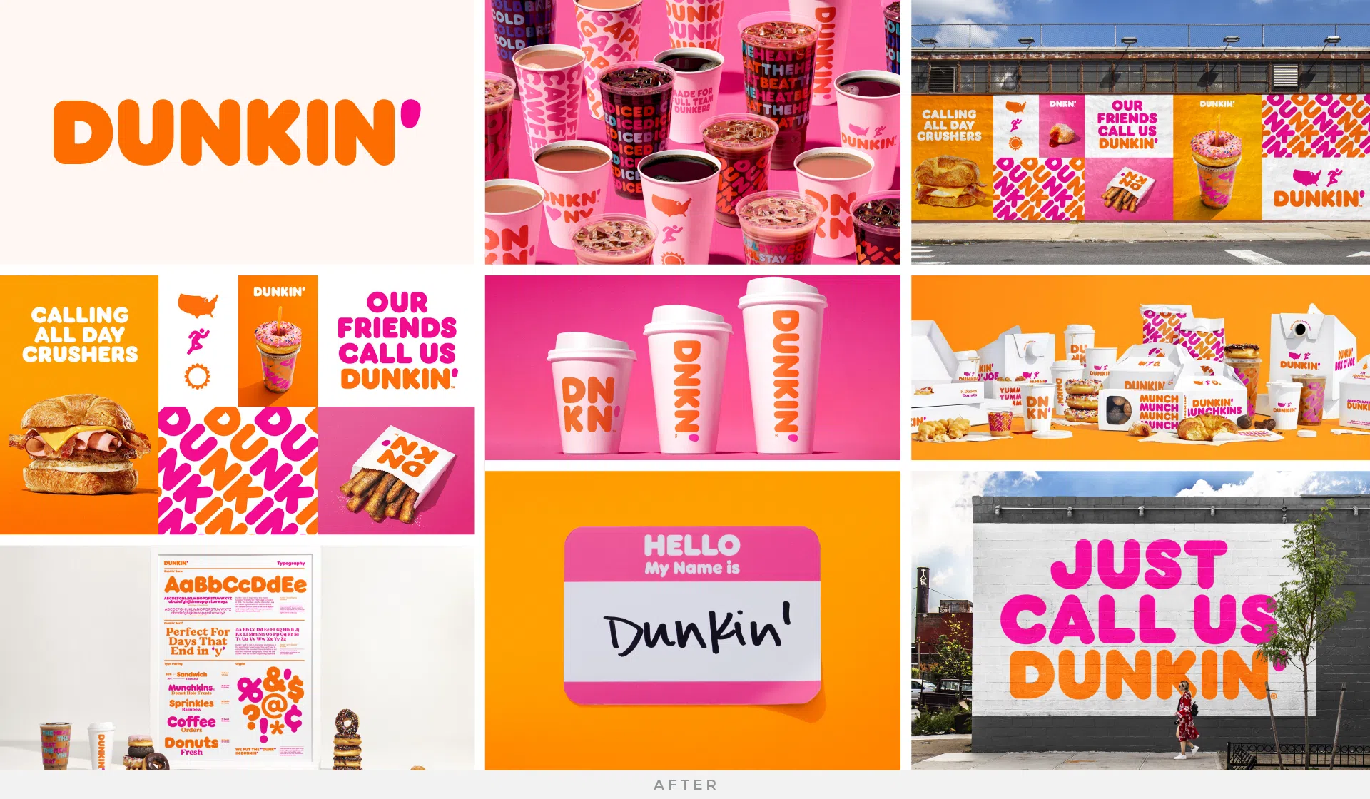
The Dunkin’ Donuts 2019 rebrand was driven by the company’s desire to position itself as more than just a donut chain, but as a destination for a wide range of beverages and snacks. This strategic shift was essential to adapt to changing consumer preferences and behaviors, as people increasingly sought convenience and healthier options. By dropping “Donuts” from its name and adopting a more minimalist logo and modern aesthetic, Dunkin’ aimed to communicate its broader menu offerings, including coffee, sandwiches, and other on-the-go snacks. The rebrand was not only about updating its image but also about reaffirming its commitment to providing quality products and a welcoming environment for customers, reflecting the evolving demands of the market.
Dunkin’s rebrand proved to be successful for several reasons. Firstly, it effectively communicated the company’s evolution from a traditional donut shop to a multi-faceted quick-service restaurant chain. The simplified branding resonated with consumers, making it easier for them to identify Dunkin’ as a go-to destination for their daily caffeine fix and quick bites. Additionally, the rebranding efforts were supported by strategic marketing campaigns and store redesigns, enhancing the overall customer experience and reinforcing Dunkin’s position as a leader in the competitive fast-food industry. Overall, by embracing change and embracing a more versatile brand identity, Dunkin’ successfully navigated the shifting landscape of consumer preferences and maintained its relevance in the market.

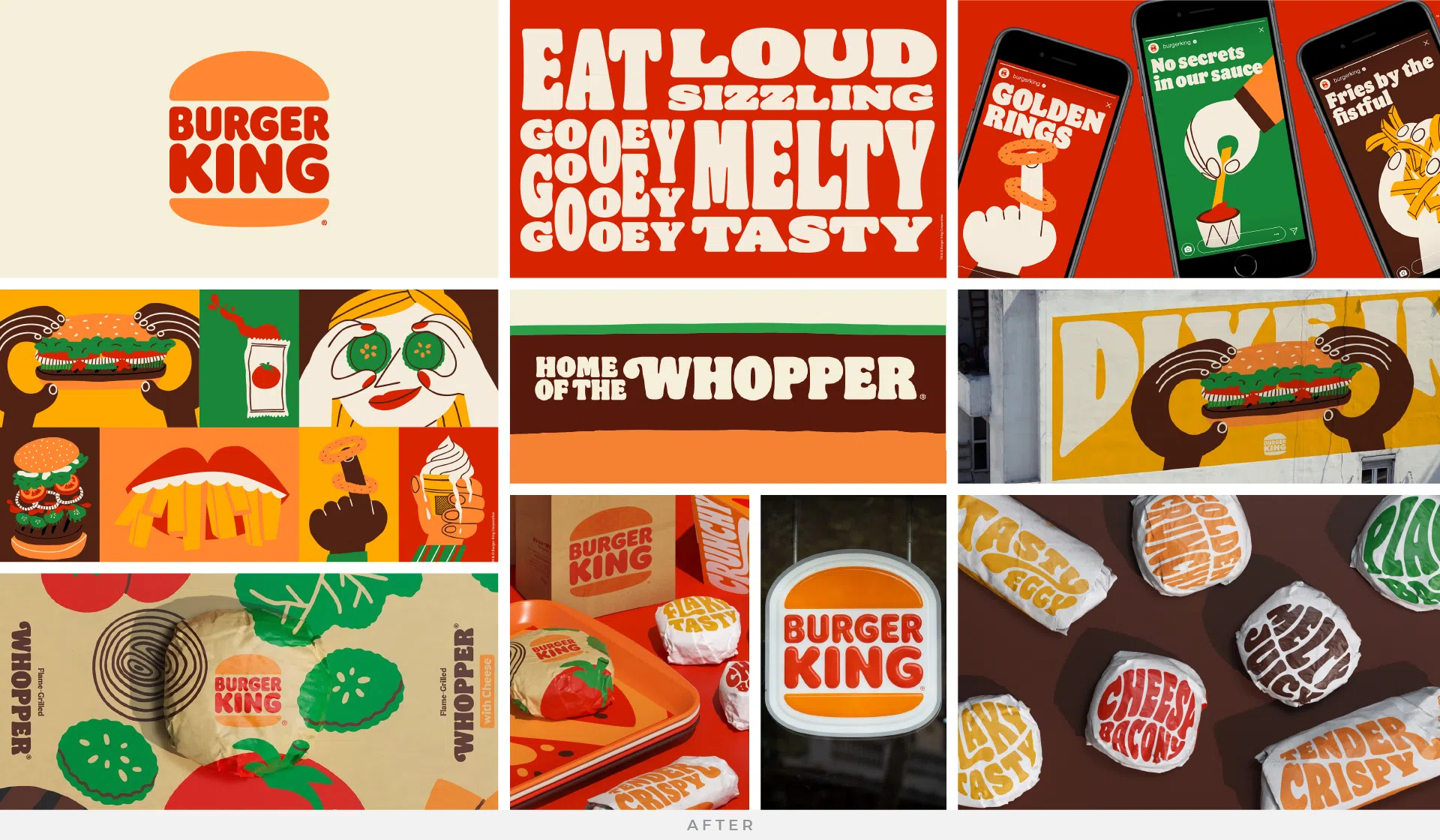
Burger King
Burger King’s rebrand in 2021 represented a strategic response to the evolving tastes and preferences of consumers, as well as the need to stand out in a crowded market. The revamp was imperative to rejuvenate the brand’s image and rekindle consumer interest, particularly among younger demographics increasingly drawn to more contemporary and health-conscious options. By embracing a modern, minimalist aesthetic while retaining elements of nostalgia, Burger King aimed to strike a delicate balance between honoring its heritage and appealing to a new generation of customers. Leading the retro revival, they ditched their 1999 logo in favor of a flat design reminiscent of the logo used by the brand throughout the 1970s-90s. The simplified logo uses a custom typeface and a fresh color palette directly inspired by the food itself. The revamped branding pays homage to the brand’s heritage with a refined design that is confident, bold, and refreshingly familiar.
The success of Burger King’s rebrand in 2021 can be attributed to its skillful blend of retro-inspired elements with a forward-looking approach. The new branding channels a sense of nostalgia through its typography, color palette, and imagery, evoking fond memories of the brand’s iconic campaigns and heritage while infusing them with a modern twist. This strategic fusion of past and present resonated with consumers, striking an emotional chord while signaling Burger King’s commitment to innovation and relevance. Moreover, the rebrand’s emphasis on sustainability and community involvement further enhanced its appeal, fostering deeper connections with socially-conscious consumers and reinforcing Burger King’s position as a leader in the fast-food industry.

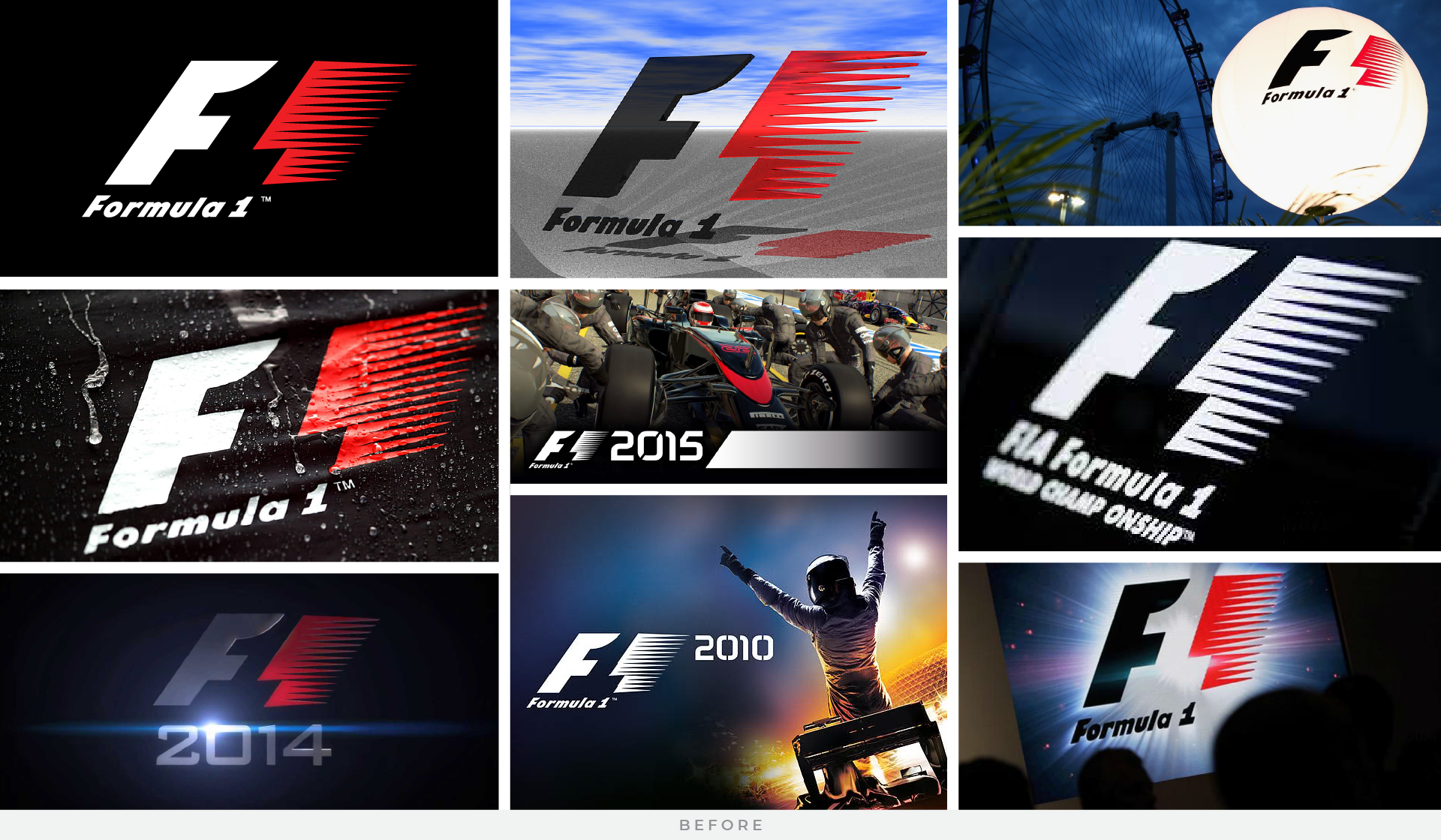
Formula 1
The Formula 1 rebrand in 2017 was a pivotal moment for the sport, aimed at revitalizing its image and enhancing its global appeal. The rebrand was necessitated by the need to modernize Formula 1’s visual identity, aligning it with contemporary design trends and reflecting its status as the pinnacle of motorsport. The previous logo, in use for over two decades, was considered outdated and lacked the dynamism and sophistication expected of a premier sporting brand in the digital age. Moreover, with the change in ownership and leadership under Liberty Media, there was a strategic imperative to usher in a new era for Formula 1, one that would resonate with both existing fans and new audiences worldwide.
The rebrand proved to be successful for several reasons. Firstly, the new logo and visual identity brought a fresh, sleek aesthetic that better represented the high-speed, high-tech nature of Formula 1 racing. It conveyed a sense of innovation and excitement, attracting attention and engagement across various platforms. Additionally, the rebrand was part of a broader strategy to enhance the fan experience, with initiatives such as digital content expansion and fan engagement programs. By modernizing its image and amplifying its presence in the digital sphere, Formula 1 successfully positioned itself as a vibrant, forward-thinking global brand, laying the foundation for sustained growth and relevance in the years to come.

Looking for a refresh? Let Techint Labs help
Remember, rebranding isn’t just about changing logos or slogans—it’s about redefining a brand’s identity, purpose, and promise to its community. The rebrands discussed above exemplify the power of strategic branding in shaping a company’s trajectory.
At Techint Labs, our passion is helping brands tell their stories, connect with their audience, and thrive in the revolving door of digital advertising. Whether a complete rebranding overhaul or a targeted digital campaign, our award-winning team is here to help your brand make its mark.
Contact us today to chat with our team and learn what we can do for your brand’s transformation.